
Every company, from a solopreneur to a large nonprofit to a Fortune 500 company, needs a KPI dashboard to track their key performance indicators (KPIs), their most important data. After all, you want to get the best, most current data to your team so they can make great decisions.
The problem is how? No one wants to login and download 50 different reports, enter them into a spreadsheet, or design a pdf to post to the slack channel every week. At automatonarmy.com, we have a firm no data entry rule!
No, you need a KPI dashboard that can be automated, easy to customize, and that can connect to your most important tools.

Well, just today I created a KPI dashboard in about an hour that runs automatically every day. It has the most important metrics for my team, doesn’t require a new subscription, and can be extended to include data from 7,000+ apps.
And in this guide, I want to show you exactly how I did it, and how you can create it yourself.
One thing to note: this is a bit technical. I’m going to make it as simple as possible, but if you need some help implementing this for your company, schedule a consultation and I’d be happy help automate your dashboard. Schedule a 30-minute consultation here.

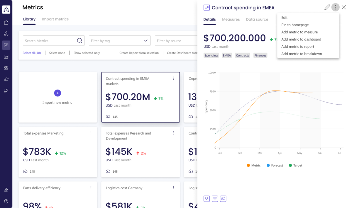
Here’s a sample dashboard I made using Zapier and Airtable.
Why You Shouldn’t Use KPI Dashboard Tools
I created this automation myself with Zapier, but there are existing tools to create performance dashboards for any kind of company.
These tools connect to your existing tools and data sources and output beautiful, customizable dashboards.
Before I share the best options, there are three reasons you might not want to use pre-built dashboard tools:
- Cost. There are (very) limited free options, but most of the KPI dashboards I found have costs. The cheapest was $10 per user per month (fine for a small team, but quickly gets expensive), and other tools vary between $60 to $100 per month. My process is completely free if you have an existing Zapier account (and if you don’t, you probably should—here’s why).
- Integrations. While the tools below all include integrations with some of the most common company applications—including Quickbooks and many CRMs—if they don’t integrate with your most important tool, how useful are they? My process uses Zapier to integrate with 7,000+ applications!
- Inflexibility. Most existing dashboard tools offer many ways to integrate into your workflow, but there’s no getting around that if you create it yourself, you’ll have infinite more ways to integrate your dashboard for your specific needs (for example, to text you a screenshot every day, email key stakeholder the top numbers, or draft an investor letter every week with your KPIs).
So keeping that in mind, here are the best KPI dashboard tools you might choose from:
The Best Tools to Create a KPI Dashboard
Note: I’m not an affiliate of any of these tools.
 Cascade
- Integrations: 1,000 integrations
- Powerful, but perhaps too complicated for a basic dashboard
- Cost: Has a free tier, but they make you contact them for regular pricing (always a scary sign!)
 Microsoft Power BI
- Integrations: 100 native integrations (especially for enterprise level tech, like Oracle and AWS), as well as Microsoft products
- More focused on large corporations. Feasible but challenging to integrate with other apps.
- Apparently complicated and laggy (shocking considering it’s Microsoft!)
- Has a popular “dashboard in a day” workshop (but we can do it in an hour, so…)
- Cost: $10 / mo per user to start
Learn more about Microsoft Power BI »
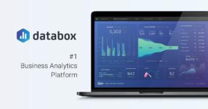
Databox
- Integrations: 70 integrations
- Quick and clean but fewer integrations
- Cost: $59/mo to get started, but plans go up to $999/mo
 Geckoboard
- Integrations: 80 Integrations
- Seems simple, slick, but a little pricey.
- Cost: $55/mo
 Tableau
- Integrations: Tableau seems to require custom APIs to integrate with anything (so you’ll probably need a developer or a lot of LLM help)
- Nice visualizations but way too technical to setup
- Cost: $75 / user (although viewers are only $15 / user)
Any that we missed that you like? Leave a comment below and let me know!
These tools are great, but they can also just feel like one more monthly subscription you have to pay for. What if you could build your own KPI dashboard in under an hour with automation tools you already may have access to?
How to Build Your Own KPI Dashboard in Under 1-Hour
In this tutorial, we’re going to be using just a few tools to automate our custom KPI Dashboard in just under an hour.
- Zapier to fetch our KPI data (see a template zap)
- Airtable to visualize our data (see a template for the Airtable)
- (optional) Slack to update key team members with the specific data they need
However, as I mentioned, the advantage of building your own solution is that you can now do anything you can imagine with your data, whether plug it into your LLM assistant, add to a Google doc to draft an investor letter, or upload to a screen printing company to wear as a T-shirt. It’s UP TO YOU!
Step 0: Decide Which KPIs You Want to Track
There are whole books about how to track and center your team around the right KPIs, but here are some ideas:
Financial KPIs
- Cash Balance
- Monthly Recurring Revenue (MRR)
- Customer Acquisition Cost
- Lifetime Value of a Customer (LTV)
Customer Success KPIs
- Tickets Resolved
- First Response Time
- Customer Satisfaction Score (CSAT)
- Net Promoter Score (NPS)
- Churn Rate
Marketing and Brand KPIs
- New Reviews + Average Review Score
- Daily Impressions
- Website Traffic
- Conversion Rate
- Cost Per Lead (CPL)
- Social Media Engagement
- Email Subscribers
Sales KPIs
- Qualified Leads
- Sales Meetings Scheduled
- Lead-to-Customer Conversion Rate
- Average Deal Size
While this should give you a lot of ideas of things to track, I highly recommend just picking 5 (or less). While you can measure everything, you can’t manage everything. Pick the KPIs that matter MOST to your business.
Then, once you’ve decided which KPIs you want to track, think about how you can access that data automatically. For example, cash balance might be in Quickbooks. Tickets resolved might be in Zendesk. Email subscribers might be in Hubspot. You might even store them in specific spreadsheets. Nearly anything that’s online can be accessed by Zapier, so think about where Zapier can find that data.
In a moment, we’re going to use Zapier to collect all that data into one place. But first, let’s create the zap.
Step 1: Create a New Zap with a Schedule Trigger
The first step is easy. You’re going to log into Zapier (https://zapier.com/app/home), and create a new Zap.

Then, once it’s open, add our trigger step, Schedule by Zapier.

I set this to trigger every day at 8 am, but choose the schedule that works best for you.
Step 2: Connect Your Apps to Zapier
In Step 1, I asked you to think about what apps contain the KPIs you want to track. Now it’s time to put them to use.

Create a new step and integrate with your first application. You’ll need to login to the app through Zapier’s interface, following the instructions they give you. If you need support, Zapier has great documentation and customer serviec.
Step 3: Create a Custom API Request
Some of the apps we connect to might have easy access to the data we need, but annoyingly most won’t. For some reason, Zapier makes it really easy to get one item, like one invoice for example, but they make it really tricky to get summaries of all your items, like your bank balance, for example.
Don’t worry though, because we have a workaround: custom API calls.

This is going to take a little work and possibly some help from ChatGPT, but don’t get scared. If I can do it, you can do it!
About APIs
So the first and hardest part of this process is getting the request url for your integration.

Think about a request URL like a link to a google sheet. The URL is where all the data is, and you just need to put the right address into the URL to get it.
But how do you find the URL. Most integrations will have extensive API documentation, so you can search up “[YOUR TOOL] Api documentation” inserting the name of your tool, e.g. “Quickbooks API documentation.” You can even get more specific and search for the KPI you’re looking for, like, “Quickbooks API documentation bank balance.”
An even better option is use ChatGPT, which tends to be really good at finding and then outputting documentation. Here’s an example prompt you might use:
Hey chat. Can you help me construct an API request for [YOUR TOOL] to get [YOUR KPI]. Please output the exact Request URL, then separately the query parameters and request headers I’ll need. I’m going to be using Zapier to connect to this API and fetch the data.
That should get you what you need!
Quickbooks Tip
If you use, Quickbooks it might be a little trickier than other apps, because they put your company’s ID (they call it Realm ID for some crazy reason) in the URL. But of course, they don’t display your realm ID anywhere I could find on your normal account. You have to go to their developer hub to get it (you may need to create a developer account, but that part is very simple). Just grab the account ID from the API playground here and you’ll be ready to go.
Once you fill in your API request, test it. There’s a 50 percent chance it doesn’t work the first time. Don’t freak out! Either take a screenshot and send it to ChatGPT to ask for help, or use Zapier’s copilot feature to explain the error and offer solutions.
After testing, you’ll get a 200 response, meaning it succeeded, and you can move on to the next step.
Step 4 (Optional): Format for Visualization
 Sometimes your data will come out formatted weird.
For example, when I queried Quickbooks for my balance sheet, instead of returning just the total cash balance, it displayed it like this:
Total Current Assets,1234,Total Liabilities,111,Total Equity,1123
As you can see, it’s outputting a whole section of the report, not the specific value I need, which is next to Total Equity. (Note: I just made these numbers up.)
If that happens to you, you can use formatter to pick the right value from the list (or to do any kind of formatting you need).
For this instance, I used Formatter > Utilities > Pick from list > Choose Last, since I wanted the last entry in the array.
Step 5: Add the Metrics to Airtable
Or Google Sheets or any other spreadsheet tool. Airtable is nice because it has some great visualization interfaces.
Check out this sample Airtable template for how I set mine up.
You can see how simple the table is—just 4 fields, one for each KPI we’re tracking plus the date. This could easily be extended to add more dates, or even, as you get more data into your table, to compare historical data, e.g. creating a formula column to show the change from a week ago.
You can also create an interface to visualize the data, like I did in the sample Airtable here, adding charts to show the change in that KPI over time. But you can customize this in almost an infinite number of ways.

Note: to use this Airtable interface yourself, change the filter from “exact date” to “today.”
Step 6 (optional): Send a Slack Message with the KPI Data
Or alternatively an email, text message, or any other message system you use. You can also send specific messages to specific stakeholders so they get only the data they need.
Add all the data, then consider formatting with a little markdown, like this:
*Daily Dashboard*
*Email Subscribers*: {{field}}
*Cash Balance*: {{field}}
*MRR*: {{field}}
There you go. You now have a fully automated KPI Dashboard! Congrats!
How to Extend Your Performance Dashboard
It’s one thing to have the data. It’s another thing to know what to do with it. Here are some ideas on how you can go beyond just collecting the data to
- Use Python scripts to collect data from other sources, not accessible to Zapier.
- Compare data to previous week, month, year, etc. (Easy with an Airtable formula field.)
- Ask ChatGPT or Claude for insights on the data.
- Create a weekly or monthly investor letter, asking chat GPT or Claude to summarize the data in the form of a letter then add it to a Google Doc.
- Create custom interfaces with metrics for specific teams or stakeholders.
- Use Python to generate a visualization and then send that to slack instead of the bland numbers.
- Create a public version of the dashboard and embed it on your website, so the public can follow along with your progress.
Those are just a few ideas to get you started. There are so many ways to extend this dashboard into every part of your business.
KPI Dashboards That Serve YOU
Every company needs a KPI dashboard, something to help them see their progress on the goals that are most important to them.
But actually creating a dashboard is either filled with a lot of busywork (like someone manually creating it on a regular basis), or reliant on tools with some significant drawbacks (cost, lack of integrations, and inflexibility).
The good news is that you don’t have to rely on those other tools. You can make your own, with things you already have access to (or should if you don’t have Zapier already).
And you can do it in less than an hour.
So go get started making your dashboard, and when you do, make sure to let us know how it went!
Need help? Every business needs a KPI dashboard, but if you need some help implementing this for your company, schedule a consultation. We’ll get your dashboard up and running right away. Schedule a 30-minute consultation here.
What KPIs do you currently track or want to track? What metrics would be the most useful to have on a performance dashboard like this? Let me know in the comments!